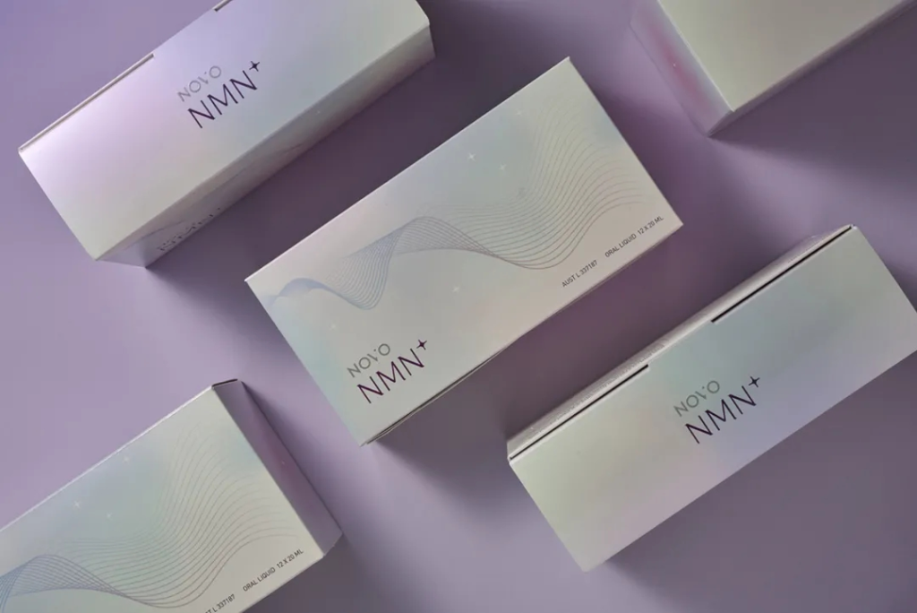
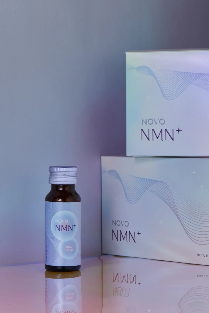
Today, let’s talk about a recently completed project, packaging for NOVO NMN+ oral liquid. NOVO pharmaceutics is a biotechnology company in Australia, which plans to introduce a brand-new aesthetic oral liquid combining Chinese and western technologies to the market.
Product
NOVO NMN+ contains ginseng to prolong the lifetime of cells, resveratrol which can resist aging, oxidation and inflammation and protein capable of improving skin elasticity. As an anti-aging aesthetic oral liquid, NOVO has applied a brand-new ingredient -NMN, which can effectively supply NAD. That will improve the fertility of women of reproductive age, and have the effects of anti-aging, prolonging lifetime and reducing age .
Draft Packaging Design
As for the material of the packaging box, sugarcane bagasse paper with pearl coating is selected, which displays different degrees of pink-purple gradation from different angles. This special eco-friendly paper can well interpret the low- profile and exquisite visual characteristics that the brand pursues.
In the printing process, three techniques, namely, relief printing, four-colour printing and reverse varnish are used, so as to achieve the ideal visual effect envisaged in computer drawing design.
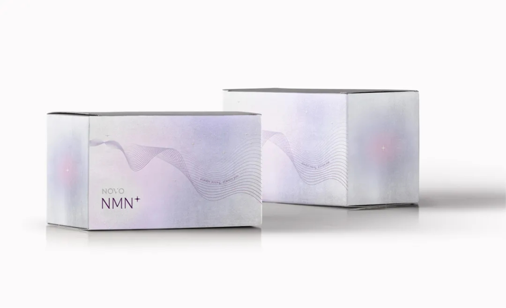
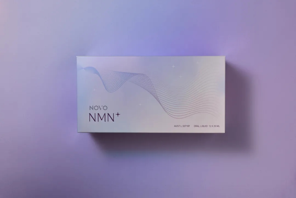
The front of the package looks like Milky Way with mysteriously starry sky and a sense of science and technology depicted by abstract curve. The NMN, a substance that is naturally found in all our cells, as a key selling point is highlighted. At the back of the box, the ingredient list is printed.
The simpler the design, the more attention should be paid to the selection of packaging materials. This special sugarcane bagasse paper with pearl coating that can’t be copied is what we fancy at first sight. At first glance, it is pearlescent, but with the change of light, it will present polarised light from pink to purple and blue, which is exactly the material we are looking for.
The Final Packaging
Because the internal bottle label can’t use this kind of paper, it’s difficult to make the label and the box consistent. In the end, the gradient effect of pearlescent colour is adopted, and the gradient colour is just the polarised colour we used.
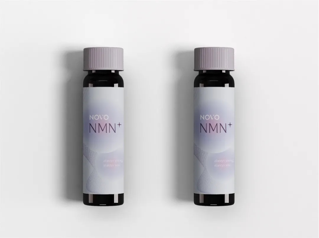
We never let go of any details when proofing. The colour of the oral liquid bottle cap was confirmed after many adjustments. Purple is not difficult to print and dye, but the difficulty is the accuracy of the colour. Although it is only a small bottle cap, it will affect the sale of the product if it is visually darker or lighter.
Let’s take a look at our final packaging!
